
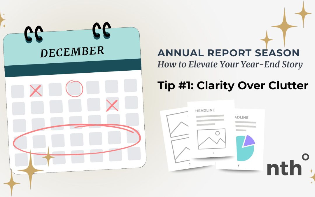
Designing Reports People Actually Want to Read
Annual reports, impact reports, and year-end summaries have one job: to communicate your story clearly. But too often, they end up overloaded with text, jam-packed with charts, and buried in details that distract from what really matters. The result? People stop reading long before they get to the good stuff.
Clarity always wins.
Here’s how to design reports your audience actually wants to open.
Start with the core message
Before touching layout or visuals, define the one thing you want readers to walk away with. Is it your organization’s impact? Growth? Community stories? That central message should act like an anchor for every design decision.
Use hierarchy to guide the eye
Headers, subheads, and consistent spacing do more than make a page look clean. They tell readers where to look first, what’s most important, and how to move through the information without getting lost.
Break up heavy content
Big blocks of text feel overwhelming. Pull quotes, short paragraphs, data callouts, icons, and whitespace all help readers breathe between sections. The easier your content feels to scan, the more likely it is to be understood.
Choose visuals with intention
Charts, graphics, and photos should reinforce the story… not just decorate it. Use them to highlight what changed, what improved, or who was impacted. If an image doesn’t help comprehension, it probably doesn’t belong in the layout.
Whitespace is not “empty”
Whitespace is one of your strongest design tools. It brings calm, focus, and structure to the page. Thoughtful spacing makes your content approachable and professional… and it instantly reduces the visual overwhelm that pushes readers away.
Clarity builds trust
A clear, readable report tells your audience you respect their time. It communicates transparency, confidence, and professionalism… all essential for organizations that rely on donors, supporters, or community trust.
Bringing It All Together
When your report leads with clarity, everything else becomes easier: your message is stronger, your design feels intentional, and your audience actually absorbs what you worked so hard to share. Clutter complicates. Clarity connects.
If you want your next annual or impact report to feel clean, readable, and beautifully on-brand, I can help. Reach out anytime: let’s make this year’s report one people are excited to flip through.

 EN
EN  ES
ES