Dec 23, 2025 | Graphic Design, Uncategorized
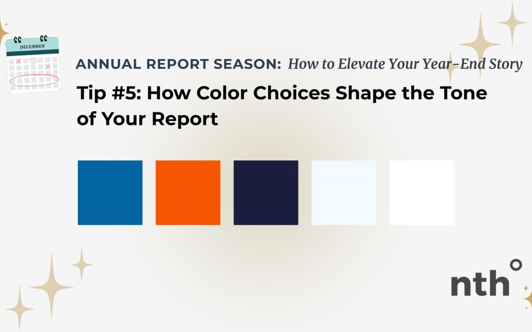
Color does more than make a report look “on brand.” It sets the emotional tone before a single word is read. The right color palette can communicate trust, warmth, urgency, or calm… while the wrong one can distract, overwhelm, or confuse. Here’s how to use color...

Dec 19, 2025 | Graphic Design, Uncategorized
A strong annual report layout should feel invisible. Readers shouldn’t have to work to understand where to look next or what matters most… the design should gently guide them through the story. When layout is done well, your message feels calm, intentional, and...
Dec 12, 2025 | Graphic Design, Uncategorized
Numbers matter… impact, reach, outcomes, budgets, growth. But too often, annual reports become a wall of charts, tables, and percentages that cause readers to check out instead of lean in. The good news? You don’t need more data to make your point. You just need...
Dec 9, 2025 | Graphic Design, Uncategorized
Designing Reports People Actually Want to Read Annual reports, impact reports, and year-end summaries have one job: to communicate your story clearly. But too often, they end up overloaded with text, jam-packed with charts, and buried in details that distract from...


 EN
EN  ES
ES