
Here’s the thing about accessibility problems: most of them are invisible to the people who built the website.
Not because those people didn’t care, but because they don’t experience the web the way a screen reader user does, or a keyboard-only user, or someone with low vision navigating with high contrast settings.
You can look at an inaccessible website and see nothing wrong at all.
That’s where testing comes in. The good news is that you don’t need a big budget or a technical background to get started. There are free tools that will tell you, clearly and specifically, where your website is falling short.
This post covers the tools worth knowing, what they can and can’t find, and the errors that show up most often… including probably on your site right now.
Start here: free tools you can use today
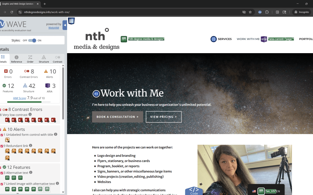
WAVE: This is the most accessible entry point for non-developers. Paste any URL into the WAVE web tool, or install the browser extension, and it will overlay your actual webpage with icons indicating errors, alerts, and structural information. You can see exactly where problems are appearing in the context of your real content. It’s visual, immediate, and genuinely useful even if you’ve never looked at a line of code. Start here.
axe DevTools: A free browser extension from Deque Systems, axe is widely used by developers and accessibility professionals. It runs directly in your browser’s developer tools and flags WCAG violations with clear explanations and links to guidance on how to fix them. More technical than WAVE, but the free version is powerful and the issue descriptions are some of the clearest in the industry.
Google Lighthouse: Built directly into Chrome, no download required. Open Chrome DevTools (right-click anywhere on a page and choose “Inspect”), navigate to the Lighthouse tab, and run an accessibility audit. It gives you a score and a list of flagged issues. It’s not comprehensive, but it’s fast, it’s always available, and the score gives you a useful baseline to track improvement over time.
Siteimprove Accessibility Checker: A free Chrome extension that’s particularly friendly for non-technical users. It categorizes issues by severity and provides plain-language explanations. Good for content editors and communications staff who manage web content but aren’t developers.
WebAIM Contrast Checker: A simple web tool where you plug in two colors (your text color and your background color) and it tells you whether the combination meets WCAG contrast requirements. Bookmark this one. You’ll use it more than you expect.
Color Contrast Analyzer (TPGi) A free desktop application that lets you pick colors directly from anything on your screen (not just hex codes) and checks them against WCAG ratios. Useful when you’re looking at a design file or a live page and need to check contrast in context.
You don’t need JAWS to test with a screen reader
If you’ve looked into screen reader testing before, you’ve probably encountered JAWS (Job Access With Speech), one of the most widely used screen readers in the world. You’ve also probably seen the price tag. A professional license runs several hundred dollars a year. For a small business or nonprofit already stretched thin, that’s not a realistic testing tool.
The good news is you don’t need it.
There are free options that will give you a genuine sense of how your website sounds and behaves for a screen reader user:
NVDA (NonVisual Desktop Access) Free, open-source, and Windows-based, NVDA is one of the most commonly used screen readers among people with visual disabilities, which means testing with it reflects real-world usage. Download it at nvaccess.org. Pair it with Firefox or Chrome for best results.
VoiceOver Already on your device if you have a Mac, iPhone, or iPad, no download required. On a Mac, turn it on with Command + F5. On iPhone or iPad, find it under Settings > Accessibility > VoiceOver. VoiceOver is worth testing with because a significant portion of screen reader users are on Apple devices, and behavior can differ meaningfully from desktop screen readers.
TalkBack Android’s built-in screen reader, available under Settings > Accessibility. If your audience includes mobile users (and it does) testing with TalkBack gives you a picture of the mobile experience that desktop testing alone won’t capture.
Narrator Built into Windows and available without any download. It’s less commonly used by people with disabilities than NVDA or JAWS, but it’s a quick and accessible way to start getting a feel for screen reader navigation if you’ve never tried it before.
A fair warning: using a screen reader for the first time is disorienting. That’s actually the point. Spend a few minutes navigating your own website without looking at the screen, just listening. Try to find your contact information. Try to fill out a form. Try to understand what’s on the page from the audio alone. What you experience in those few minutes will tell you more about your site’s accessibility than any automated scan.
What these tools can find… and what they can’t
Automated tools are reliable for a specific category of issues: things that are technically verifiable without human judgment.
They’re good at finding:
- Images missing alt text entirely
- Very low color contrast between text and background
- Form fields with no associated label
- Pages with no title or a generic title
- Missing document language settings
- Keyboard focus issues that can be detected in code
- Empty links or buttons with no descriptive text
- Skipped heading levels
What they cannot do is tell you whether your alt text is actually meaningful, whether your heading structure makes logical sense for someone navigating by screen reader, whether your form error messages are actually helpful, or whether your content is written clearly enough for someone with a cognitive disability to understand.
Those things require human review… and ideally, testing with people who use assistive technology.
A commonly cited figure in the accessibility industry is that automated tools can catch somewhere between 30 and 40 percent of WCAG issues. That means the majority of what matters can only be found by a human. Automated scanning is a starting point, not a finish line.
The errors I see most often
These are the violations that show up again and again across websites of all kinds.. nonprofit, government, small business, large organization… even Facebook.
If you run a WAVE scan right now, there’s a good chance you’ll see several of these flagged.
Missing or empty alt text: Images without alt text are invisible to screen readers. Images with empty or auto-generated alt text (filenames like “IMG_4872.jpg” or AI-generated descriptions that miss the point) can be worse than nothing. Every meaningful image on your site needs a description that conveys the same information a sighted user gets from seeing it.
Low color contrast: That elegant light gray text on a white background? It almost certainly fails. So does yellow on white, light blue on white, and many other combinations that look fine on a calibrated monitor in a well-lit room. WCAG requires a contrast ratio of at least 4.5:1 for normal text and 3:1 for large text. Run your color combinations through the contrast checker before you commit to them.
Missing form labels: Placeholder text inside a form field is not a label. When a user clicks into the field, the placeholder disappears… and a screen reader user has no way to know what the field is asking for. Every form input needs a persistent, visible label associated with it in the code.
Non-descriptive link text: “Click here.” “Read more.” “Learn more.” These phrases tell a screen reader user nothing about where the link goes. Screen reader users often navigate a page by pulling up a list of all links.Imagine a list that says “read more, read more, read more, click here, learn more, click here.” Descriptive link text is one of the easiest fixes on this list.
Videos without captions: Auto-generated captions from YouTube or other platforms are not sufficient. They are frequently inaccurate, especially with proper names, technical terms, and regional accents. Any video on your site needs reviewed, accurate captions. Audio content needs a transcript.
Inaccessible PDFs: PDFs are their own accessibility challenge. A PDF that was created by scanning a paper document is essentially an image, which is completely inaccessible to a screen reader. Even digitally created PDFs need to be properly tagged with reading order, headings, and alt text for images to be accessible. If your site relies heavily on PDFs for important information, this is worth putting near the top of your remediation list.
Skipped or illogical heading structure: Headings aren’t just for making text look bigger. They create a navigable outline of your page that screen reader users rely on to understand structure and jump between sections. Jumping from an H1 directly to an H4, using heading tags just because you like the font size, or having no headings at all are all common problems with real impact.
Missing page titles: Every page on your site should have a unique, descriptive title(the text that appears in the browser tab). A title that just says “Home” or repeats your organization’s name on every page gives screen reader users no way to orient themselves or distinguish between pages.
Your action step
Go to wave.webaim.org right now and run your homepage. Then run your most important interior page… your services page, your contact page, your donation page, wherever you most want people to take action.
Screenshot the results. Don’t panic at the number of flags. Some of them will be alerts rather than hard errors, and some will be quick fixes.
What you’re looking for is a realistic picture of where you stand.
That picture is your starting point. Everything else in this series is about what to do with it.
Next up: the design decisions that make accessibility possible from the start. Typography, color, structure, and content basics that change how you build everything going forward.

 ES
ES  EN
EN