
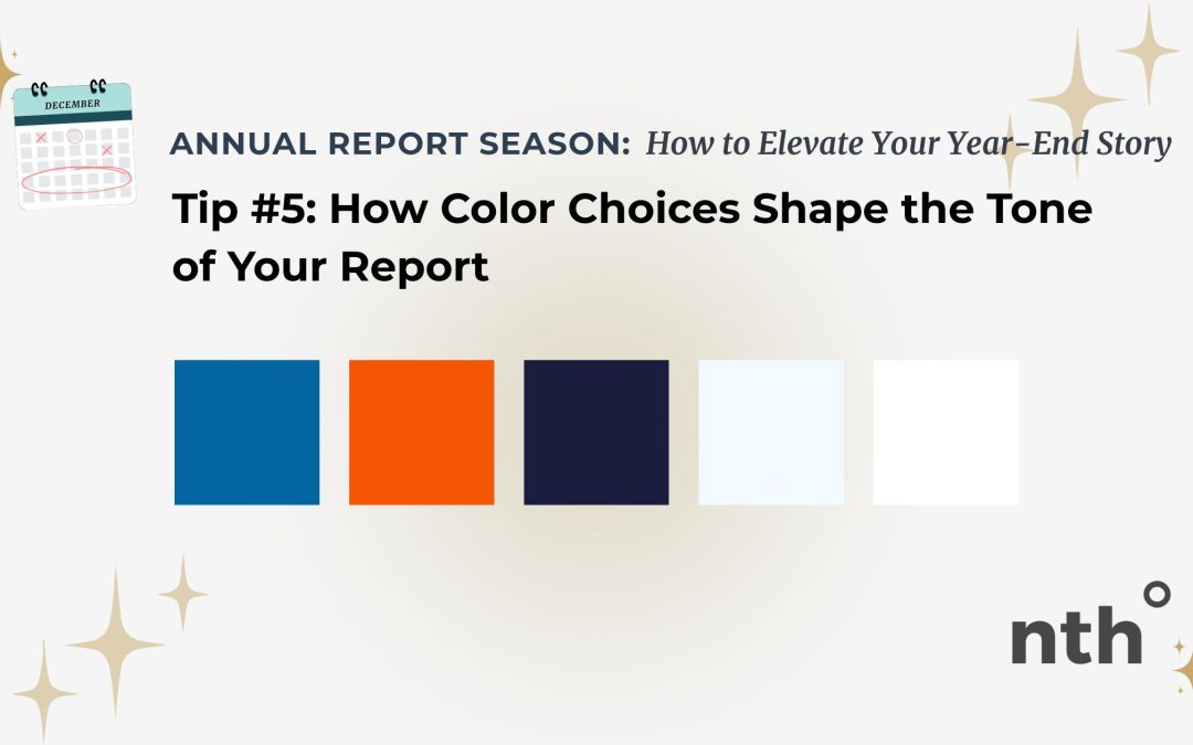
Color does more than make a report look “on brand.”
It sets the emotional tone before a single word is read.
The right color palette can communicate trust, warmth, urgency, or calm… while the wrong one can distract, overwhelm, or confuse.
Here’s how to use color intentionally so it supports your story instead of competing with it.
Start with your brand, then simplify
Your annual report should feel like a natural extension of your organization’s identity.
Begin with your existing brand colors, but resist the urge to use all of them at once.
Annual reports benefit from a restrained palette… often just one primary color, one secondary color, and a neutral.
This keeps the design cohesive and easy to read.
Use color to signal importance
Color can guide attention when used with purpose.
Highlight key statistics, section headers, or callouts with a consistent accent color so readers know what matters most.
When everything is colorful, nothing stands out.
Be mindful of emotional tone
Soft blues and greens tend to feel calm and trustworthy.
Warm tones can feel welcoming or energetic.
Darker hues can feel serious or reflective.
Choose colors that match the message you’re sharing… especially in year-end and impact reporting.
Prioritize accessibility
Color choices affect more than aesthetics.
Ensure there’s enough contrast between text and background so content remains readable for everyone.
Avoid relying on color alone to communicate meaning, especially in charts or graphs.
Accessible design isn’t optional… it’s part of clear communication.
Keep it consistent from page to page
Once your color system is set, stick with it.
Use the same colors for similar elements throughout the report.
Consistency helps readers move through the document without distraction and reinforces professionalism and trust.
Let color support, not overpower
Color should enhance the story, not steal the spotlight.
White space and neutral tones are just as important as bold accents.
When color is balanced thoughtfully, your report feels polished, calm, and intentional.
Call to Action
If your report feels visually busy or emotionally off, your color palette may be working against you.
I help nonprofits refine color systems that support clarity, accessibility, and impact.
If you’re heading into annual report season, let’s talk about how color can strengthen your story.



 ES
ES  EN
EN