
What your homepage needs to connect, convert, and actually make sense to your visitors.
If your website is your digital storefront, then your homepage is the welcome mat. It’s often the first impression someone gets of your business, and that moment needs to work.
But don’t worry: having a great homepage doesn’t mean cramming everything in one place. It means being clear, intentional, and making it easy for people to know what you do and what to do next.
Whether you’re DIY-ing your site or working with a designer (hiiiiiii, that’s me), here are the must-haves every small business homepage should include:
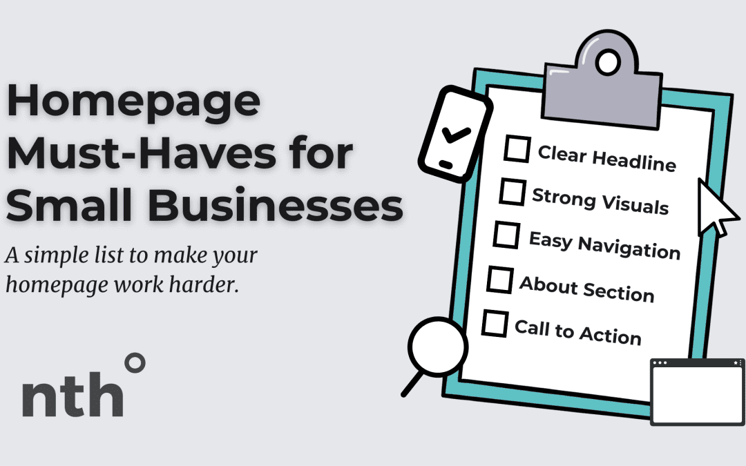
1. A Clear Headline That Says What You Do
Skip the vague jargon and get straight to the point. Your homepage headline should tell people:
- What you do
- Who it’s for
- How it helps
Think:
“Custom Photography for Small Brands in Kansas City”
“Handmade Jewelry That Tells a Story”
“Bookkeeping for Creatives Who Hate Spreadsheets”
If your visitor has to scroll to figure that out, you’ve lost them.
2. Clear Navigation
Don’t make people hunt. Stick to 4–6 main menu items and make sure they’re named clearly:
- Home
- Acerca de Mi
- Services / Shop
- Blog or Resources
- Contacto
Bonus points for a visible “Book Now” or “Start Here” button in your top navigation.
3. Strong Visuals That Match Your Brand
Your images and design should give off the feel of your brand immediately… whether that’s calm and professional, bold and energetic, or warm and welcoming.
Use:
- High-quality brand photography (not generic stock if you can help it)
- Product or service imagery
- Photos of you, your team, or your space to build trust
Pro tip: Avoid carousels. They’re rarely effective.
4. A Brief “About” Section
You don’t need your full life story, but your homepage should give people a peek into who you are and why you do what you do. A quick 2–3 sentence intro with a link to your full About page works perfectly.
5. What You Offer & Who It’s For
Use your homepage to highlight your core services or products. This doesn’t have to be long—just a few featured areas with icons or photos and a “Learn More” link is enough to help visitors get oriented.
6. A Clear Call to Action
What do you want people to do next?
- Book a consult
- Browse products
- Sign up for your list
- Read your latest blog post
- View your upcoming events
Use buttons and short copy to guide them toward it. Don’t leave them hanging.
7. Testimonials or Trust Builders
A few short client reviews, recognizable logos, or certifications can help build credibility. Even a “Featured in…” or “Trusted by…” section goes a long way.
8. A Clean, Easy-to-Skim Layout
White space is your friend. Group content in sections, use clear headings, and make sure someone can scan and get it in 10 seconds. If it feels overwhelming, it probably is.
9. Mobile-Friendly Design
Over half your traffic is probably coming from a phone, so your homepage should be just as effective (and good-looking) on mobile as it is on desktop. Test how it looks, and make sure key info is still front and center.
TL;DR: Your Homepage Should…
Say what you do and who you help
Show your personality and offerings
Guide people to take the next step
When you get your homepage right, your whole site works better… and your visitors feel more confident sticking around.
Need a second pair of eyes on your homepage? I’m just a message away.
Let’s make sure your first impression is doing your business justice.


 ES
ES  EN
EN