
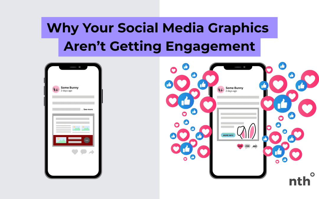
You’re posting consistently. You’ve got the graphics lined up. You’re even using the right hashtags. But still… crickets. If your social media posts aren’t getting the likes, shares, or comments you’d hoped for, the problem might not be your message—it might be your visuals.
Let’s talk about why your graphics aren’t catching attention (and how to fix it).
1. They Don’t Stand Out in the Feed
Social feeds are busy. If your graphics look too similar to generic templates or blend into the same colors/styles everyone else is using, people scroll right past. To stand out, your visuals need to reflect your brand’s personality, not just a trendy design.
Fix it: Use your own brand colors, fonts, and imagery consistently. That familiarity makes your posts recognizable in a crowded feed.
2. There’s Too Much Text
A graphic stuffed with information is hard to read, especially on a mobile device. If someone has to zoom in to figure out what you’re saying, they’re more likely to scroll on.
Fix it: Keep your graphics simple. Share one main message per image and leave the details for your caption or a link.
3. They Don’t Connect Emotionally
Pretty doesn’t equal engaging. If your designs are polished but don’t speak to your audience’s needs, struggles, or aspirations, they won’t spark interaction.
Fix it: Before you design, ask: What do I want my audience to feel or do when they see this? Then design around that.
4. Inconsistent Style Confuses Followers
If every post looks completely different—new colors, random fonts, clashing imagery—it’s harder for people to know it’s from you. Consistency builds recognition and trust.
Fix it: Create a simple style guide for your social graphics with a set color palette, fonts, and layout styles. That way, your posts always feel cohesive.
5. No Clear Call to Action
Even the best design won’t perform if people don’t know what you want them to do. If your posts lack a nudge—like “comment below,” “save this tip,” or “click the link”—people won’t take action.
Fix it: Add a clear, simple call to action in your caption and, when possible, reflect it in your design.
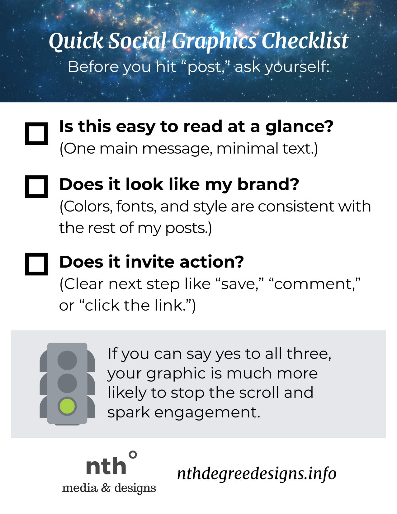
Quick Social Graphics Checklist
Before you hit “post,” ask yourself:
- Is this easy to read at a glance?
(One main message, minimal text.) - Does it look like my brand?
(Colors, fonts, and style are consistent with the rest of my posts.) - Does it invite action?
(Clear next step like “save,” “comment,” or “click the link.”)
If you can say yes to all three, your graphic is much more likely to stop the scroll and spark engagement.
Download this checklist freebie to print and stick on your desk as you create your social content!
Examples – Sample Post Comparisons
Example 1: Event Announcement
Before:
A flyer-style Instagram post with the full event description crammed in—date, time, address, speaker bios, RSVP link—all in tiny font. It looks busy and overwhelming.
After:
A clean square graphic with just the event name, date, and one strong visual. The caption contains the details and link. Readers stop, see what it is right away, and head to the caption if they want more.
Example 2: Tip/Advice Post
Before:
A Canva template filled with a long paragraph of text on a pastel background. It’s hard to read on mobile, so people scroll past.
After:
A bold graphic with a short, punchy headline like “3 Signs Your Brand Needs a Refresh.” The actual tips are shared in the caption. Simple, eye-catching, and easier to engage with.
Example 3: Call to Action Post
Before:
A pretty photo with a motivational quote, but no context or next step. Followers might like it, but they don’t interact beyond that.
After:
A branded post that says “We want to hear from you!” with a fun graphic pointing to the caption. The caption includes a simple question: “What’s your biggest challenge with social media design?” This sparks comments and conversation.
Example 4: Inconsistent Style
Before:
One post is teal and pink, another is navy and orange, and the next uses random fonts. Followers don’t recognize your posts in their feed.
After:
Every post uses your brand colors and fonts. Even if the message changes, the look feels consistent… so people can spot your posts instantly.
Final Thoughts
Great design on social media isn’t just about making something look nice. It’s about creating visuals that stop the scroll, feel true to your brand, and make people want to connect. With a few tweaks—less text, more consistency, and graphics built around your audience—you’ll start to see engagement grow.
Need help with upgrading your social media graphics and presence?
I got you.
Get in touch.

 EN
EN  ES
ES